Data Visualization
Under construction
General interpretation checklist
Study Design & Population
- Is the study design informative (powered) enough for the intended analysis?
- Is the study population relevant for the intended inference?
Data Selection & Management
- Are all relevant data available for the analysis?
- Are all data collected with the appropriate level of exactness and completeness?
- Are the data in the model independent (low correlation)?
- Are there available data that were not included in the analysis?
- How were the parameters included?
- Based on a full model approach (FFEM) or statistical significance (e.g., SCM)?
- Are there parameters that were omitted from the analysis?
- Are there parts of the analysis that are not shown? Why?
- How were the values to visualize chosen?
Data Integrity & Bias
- Are there potential biases introduced by non-random patient dropouts?
- Will the model parameterization impact the interpretation?
- Will the handling of missing data impact the interpretation?
Statistical Clarity & Rationale
- How was the uncertainty assessed?
- Is the width of the confidence interval clear?
- How was the reference/baseline chosen and computed?
- Is there an objective rationale for the width of the reference area?
Tables
https://clauswilke.com/dataviz/figure-titles-captions.html#tables
Figures
Ideally, each figure should answer only one question. You may have performed multiple independent experiments to answer one research question. The results of these independent experiments can be combined into a multi-panel figure, with one overarching declarative title.
data-to-viz.com dataviz-inspiration
Label line ends in time series with ggplot21
library(tidyverse)

d <- Orange %>%
  as_tibble()

d_ends <- d %>%
  group_by(Tree) %>%
  top_n(1, age) %>%
  pull(circumference)

d %>%
  ggplot(aes(age, circumference, color = Tree)) +
    geom_line(size = 2, alpha = .8) +
    theme_minimal() +
    scale_x_continuous(expand = c(0, 0)) +
    scale_y_continuous(sec.axis = sec_axis(~., breaks = d_ends)) +
    ggtitle("Orange trees getting bigger with age",
            subtitle = "Based on the Orange data set in R") +
    labs(x = "Days old", y = "Circumference (mm)")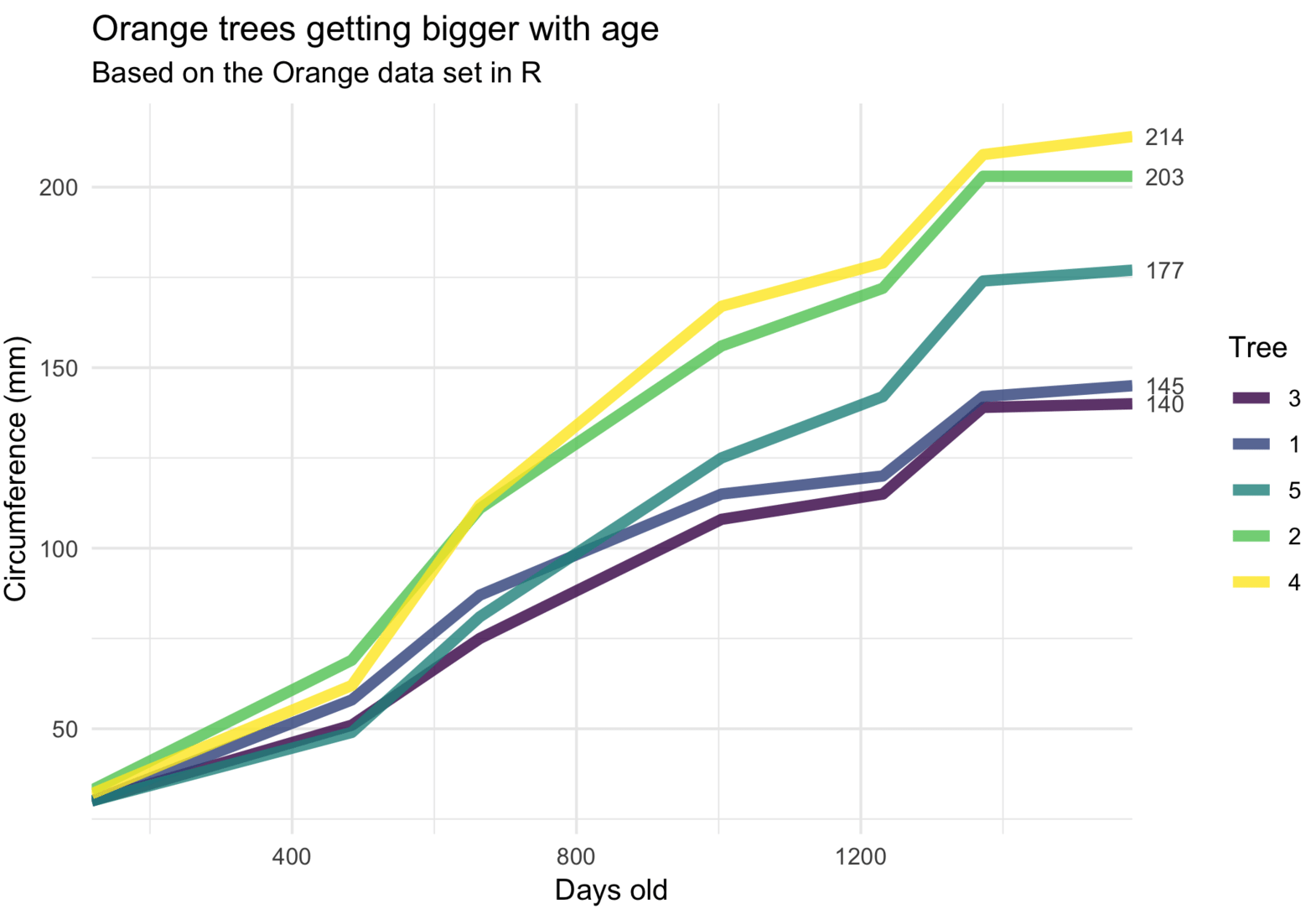
Scientific figures
biorender.com reactome.org/icon-lib bioicons.com healthicons.org scidraw.io undraw.co smart.servier.com
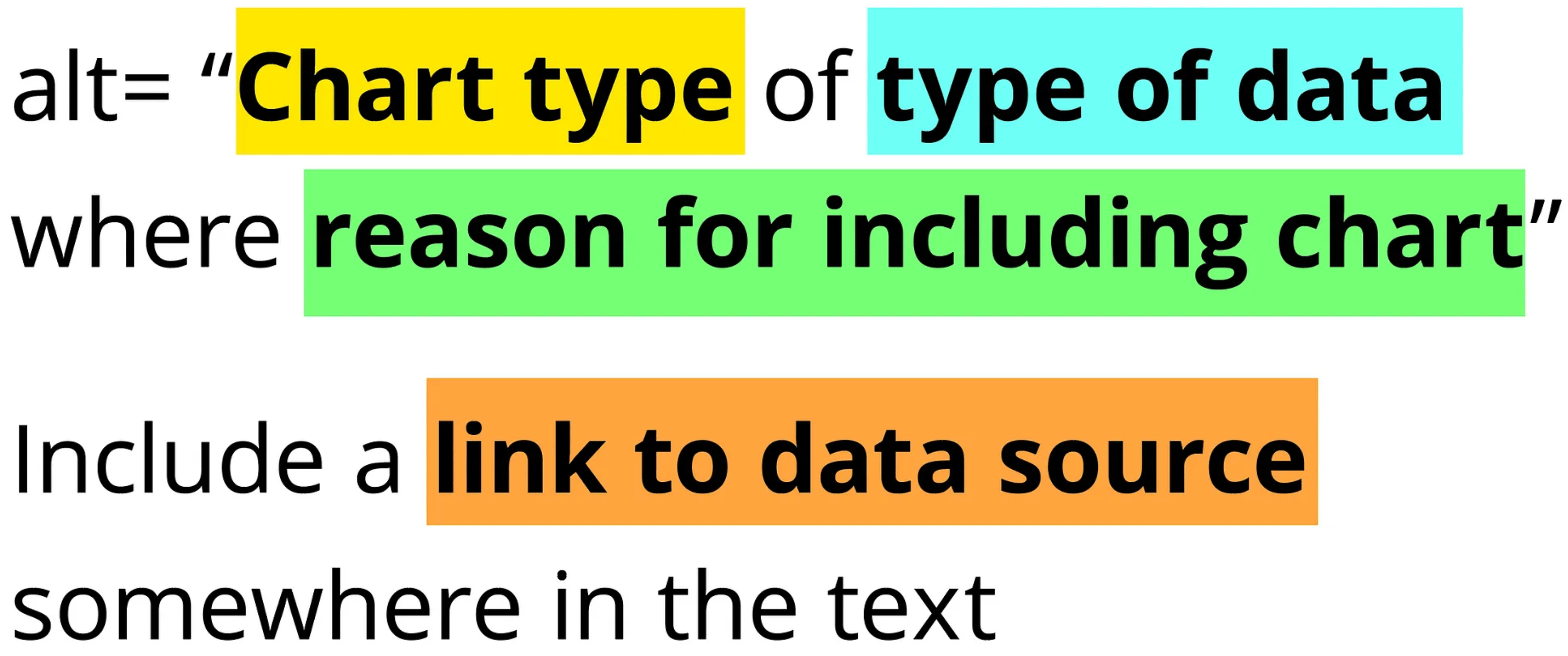
Writing Alt Text for Data Visualization
You probably can’t write text that conveys the entire meaning of a chart. But, that doesn’t mean that you shouldn’t try.
Footnotes
https://drsimonj.svbtle.com/label-line-ends-in-time-series-with-ggplot2↩︎